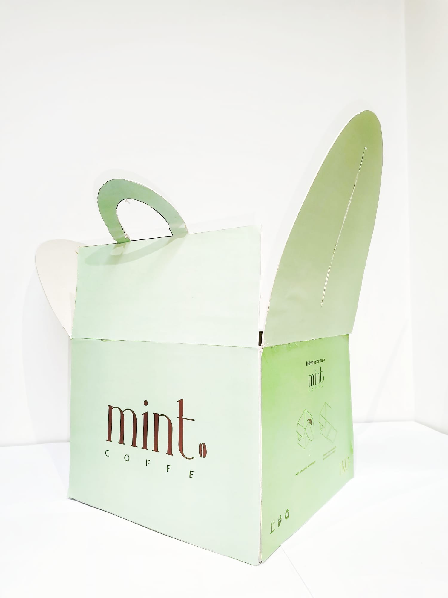
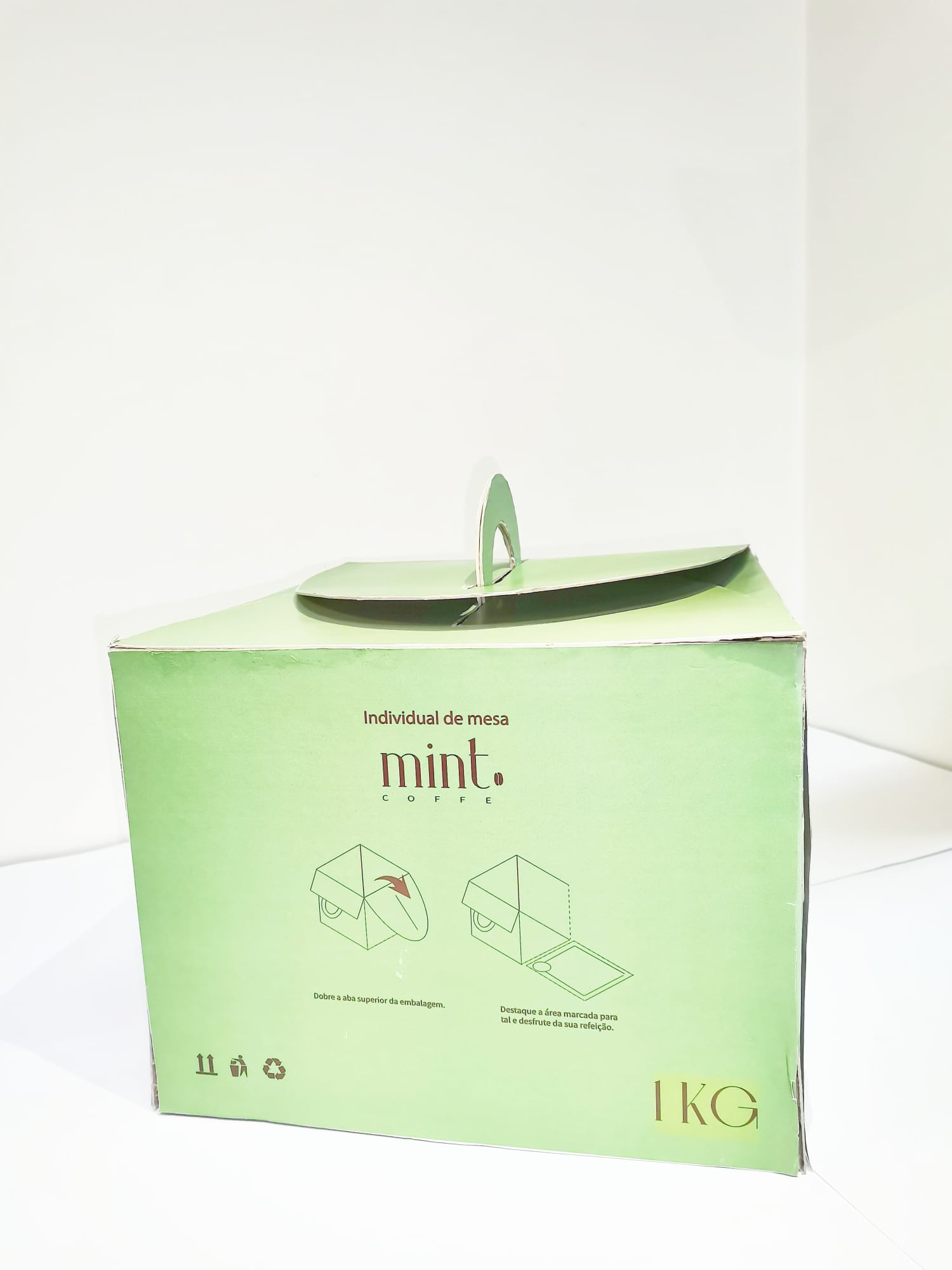
The proposal was to create a cardboard packaging
that it has other functions, being reused in some
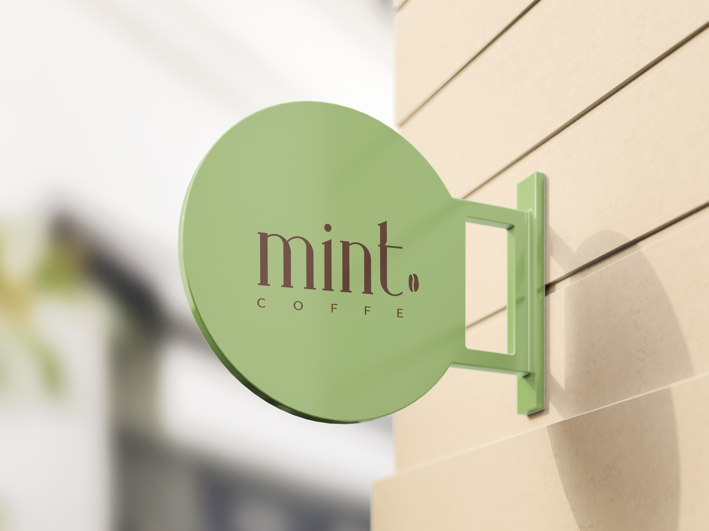
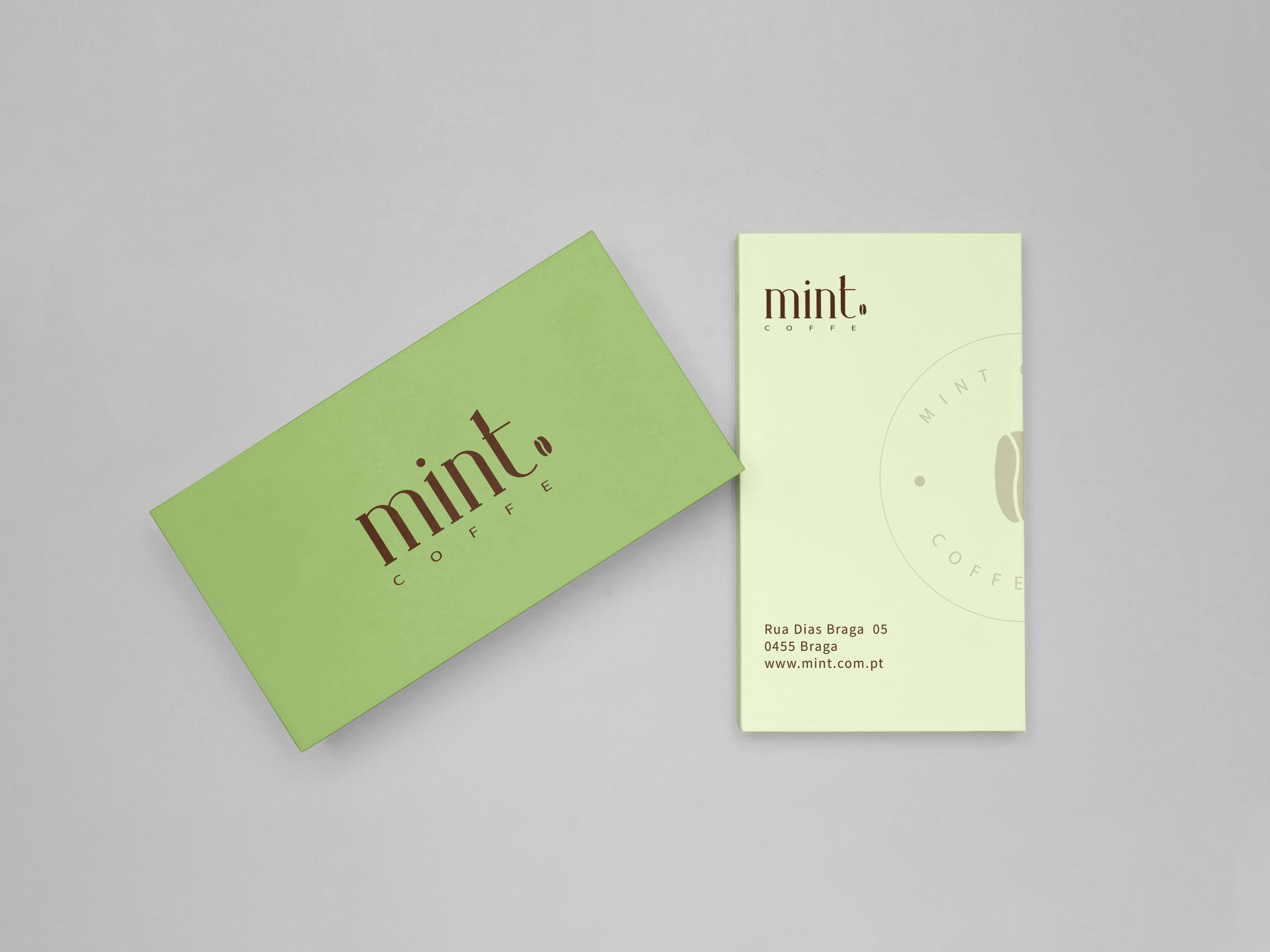
reused in some way, besides a visual identity. My idea was to create a box in which the side would become an American set to support the meal. The brand's visual identity in terms of colour is linked to the name and the coffee bean to the branch of the establishment.
